Showing posts with label Material Design Examples. Show all posts

Friday, June 5, 2015

Material TabBar Example

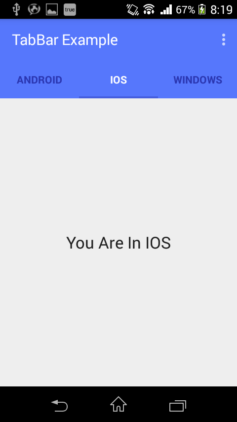
Material TabBar Example output


Tab1 : Android

Tab2 : IOS

Tab3 : Windows
Project Structure : 
Project Structure

Step 1:
Check or Edit In Dependencies : Gradle Scripes->build.gradle(Module app)
[code]compile 'com.android.support:appcompat-v7:22.1.1'[/code] Step 2:
styles.xml
Add this 3 lines between <style> and </style> Tag
[code] <!-- Customize your theme here. --> <item name="windowActionBar">false</item> <item name="windowNoTitle">true</item> [/code] Create color.xml under the directory : values
color.xml

[code] <?xml version="1.0" encoding="utf-8"?> <resources> <color name="ColorPrimary">#5677fc</color> <color name="ColorPrimaryDark">#4e6cef</color> <color name="tabsScrollColor">#455ede</color> </resources>[/code]
  • create a directory "color" under the"res" folder.
  • create "selector.xml" under "color" directory.
selector.xml

[code] <?xml version="1.0" encoding="utf-8"?> <selector xmlns:android="http://schemas.android.com/apk/res/android"> <item android:state_selected="true" android:color="@android:color/white" /> <item android:state_focused="true" android:color="@android:color/white" /> <item android:state_pressed="true" android:color="@android:color/white" /> <item android:color="#2a36b1" /> </selector>[/code] Step 3:
Create new layout xml file :
tool_bar.xml

[code] <?xml version="1.0" encoding="utf-8"?> <android.support.v7.widget.Toolbar xmlns:android="http://schemas.android.com/apk/res/android" android:layout_width="match_parent" android:layout_height="wrap_content" android:background="@color/ColorPrimary" android:elevation="2dp" android:theme="@style/Base.ThemeOverlay.AppCompat.Dark" />[/code] Step 4:
Activity_main.xml

[code] <LinearLayout xmlns:android="http://schemas.android.com/apk/res/android" android:layout_width="match_parent" android:layout_height="match_parent" android:orientation="vertical"> <include android:id="@+id/tool_bar" layout="@layout/tool_bar" android:layout_width="match_parent" android:layout_height="wrap_content" /> <com.pratik.tabbarexample.slidingTab.SlidingTabLayout android:id="@+id/tabs" android:layout_width="match_parent" android:layout_height="wrap_content" android:background="@color/ColorPrimary" android:elevation="2dp" /> <android.support.v4.view.ViewPager android:id="@+id/pager" android:layout_width="match_parent" android:layout_height="0dp" android:layout_weight="1" /> </LinearLayout>[/code]
Step 5:
Declare this classes and variables above onCreate method:
[code] Toolbar toolbar; ViewPager pager; ViewPagerAdapter adapter; SlidingTabLayout tabs; CharSequence Titles[] = {"Android", "Ios", "Windows"}; int Numboftabs = 3;[/code]
Step 6:
Add below code into onCreate method:

[code] // Creating The Toolbar and setting it as the Toolbar for the activity toolbar = (Toolbar) findViewById(R.id.tool_bar); setSupportActionBar(toolbar); // Creating The ViewPagerAdapter and Passing Fragment Manager, Titles fot the Tabs and Number Of Tabs. adapter = new ViewPagerAdapter(getSupportFragmentManager(), Titles, Numboftabs); // Assigning ViewPager View and setting the adapter pager = (ViewPager) findViewById(R.id.pager); pager.setAdapter(adapter); // Assiging the Sliding Tab Layout View tabs = (SlidingTabLayout) findViewById(R.id.tabs); tabs.setDistributeEvenly(true); // To make the Tabs Fixed set this true, This makes the tabs Space Evenly in Available width // Setting Custom Color for the Scroll bar indicator of the Tab View tabs.setCustomTabColorizer(new SlidingTabLayout.TabColorizer() { @Override public int getIndicatorColor(int position) { return getResources().getColor(R.color.tabsScrollColor); } }); // Setting the ViewPager For the SlidingTabsLayout tabs.setViewPager(pager);[/code]
Step 7:
Create package called “slidingTab” and copy and paste below two classes :
1.1 SlidingTabLayout.java 
1.2 SlidingTabStrip.java
from IOsched Google App.
Step 8:
Create package called “adapter” and under this package create a class “ViewPagerAdapter”
ViewPagerAdapter.java

[code] package com.pratik.tabbarexample.adapter; import android.support.v4.app.Fragment; import android.support.v4.app.FragmentManager; import android.support.v4.app.FragmentStatePagerAdapter; import com.pratik.tabbarexample.tabs.Tab1; import com.pratik.tabbarexample.tabs.Tab2; import com.pratik.tabbarexample.tabs.Tab3; /** * Created by prats on 6/2/2015. */ public class ViewPagerAdapter extends FragmentStatePagerAdapter { CharSequence Titles[]; int NumbOfTabs; // Build a Constructor and assign the passed Values to appropriate values in the class public ViewPagerAdapter(FragmentManager fm, CharSequence mTitles[], int mNumbOfTabsumb) { super(fm); this.Titles = mTitles; this.NumbOfTabs = mNumbOfTabsumb; } //This method return the fragment for the every position in the View Pager @Override public Fragment getItem(int position) { if (position == 0) // if the position is 0 we are returning the First tab { Tab1 tab1 = new Tab1(); return tab1; } else if(position == 1) { Tab2 tab2 = new Tab2(); return tab2; } else { Tab3 tab3 = new Tab3(); return tab3; } } // This method return the titles for the Tabs in the Tab Strip @Override public CharSequence getPageTitle(int position) { return Titles[position]; } // This method return the Number of tabs for the tabs Strip @Override public int getCount() { return NumbOfTabs; } }[/code]
Step 9:

Create package called “tabs”, under this package create 3 classes:
1)Tab1
2)Tab2
3)Tab3
And create 3 layout xml file related to this classes:
1)tab_1.xml
2)tab_2.xml
3)tab_3.xml

tab_1.xml

[code] <?xml version="1.0" encoding="utf-8"?> <LinearLayout xmlns:android="http://schemas.android.com/apk/res/android" android:layout_width="match_parent" android:layout_height="match_parent" android:orientation="vertical" android:gravity="center"> <TextView android:id="@+id/textView" android:layout_width="wrap_content" android:layout_height="wrap_content" android:text="You Are In Android" android:textAppearance="?android:attr/textAppearanceLarge" /> </LinearLayout>[/code]
Note : Do same for tab_2.xml and tab_3.xml
Tab1.java
[code] package com.pratik.tabbarexample.tabs; import android.os.Bundle; import android.support.annotation.Nullable; import android.support.v4.app.Fragment; import android.view.LayoutInflater; import android.view.View; import android.view.ViewGroup; import com.pratik.tabbarexample.R; /** * Created by prats on 6/2/2015. */ public class Tab1 extends Fragment { @Override public View onCreateViewundefinedLayoutInflater inflater, @Nullable ViewGroup container, @Nullable Bundle savedInstanceState) { View v =inflater.inflateundefinedR.layout.tab_1,container,false); return v; } }[/code]
Note : Do Same for Tab2.java and Tab3.java
Step 10:

Run the App and Enjoy it.....

Tuesday, May 26, 2015

ToolBar Android Example

                    ToolBar Example Output :

ToolBar Output
Project Structure : 

Project Structure

Step 1 :
Add dependencies in "build.gradle" file in Android Studio

dependencies {
    compile fileTree(dir'libs'include: ['*.jar'])
    compile 'com.android.support:appcompat-v7:22.1.1'    

    compile 'com.android.support:cardview-v7:21.0.3'}

Note : here i can import new module => "cardslib-core-2.0.1 aar" file from :
 http://mvnrepository.com/artifact/com.github.gabrielemariotti.cards/cardslib-core/2.0.1

Step 2 :
activity_main.xml


<LinearLayout xmlns:android="http://schemas.android.com/apk/res/android"
    android:layout_width="match_parent"
    android:layout_height="match_parent"
    android:orientation="vertical"
    android:background="#FFFFFF">
    <android.support.v7.widget.Toolbar
        android:id="@+id/toolBar"
        android:layout_width="match_parent"
        android:layout_height="wrap_content"
        android:background="@color/ColorPrimary"
        android:elevation="5dp"
        android:layout_gravity="top"/>
        <TextView
            android:layout_width="wrap_content"
            android:layout_height="wrap_content"
            android:layout_gravity="center"
            android:layout_margin="10sp"
                  android:textAppearance="@android:style/TextAppearance.DeviceDefault.Large"
            android:text="Toolbar Example"
            android:textColor="#000000"/>
</LinearLayout>

Step 3 :
menu_main.xml

<menu xmlns:android="http://schemas.android.com/apk/res/androi"
    xmlns:app="http://schemas.android.com/apk/res-auto"
    xmlns:tools="http://schemas.android.com/tools"
    tools:context=".MainActivity">
    <item
        android:id="@+id/action_search"
        android:icon="@drawable/abc_ic_search_api_mtrl_alpha"
        android:orderInCategory="200"
        android:title="Search"
        app:showAsAction="ifRoom" />
    <item
        android:id="@+id/action_user"
        android:icon="@drawable/ic_action_my_cart"
        android:orderInCategory="300"
        android:title="User"
        app:showAsAction="ifRoom" />
</menu>

Step 4 :
styles.xml

<resources>
    <!-- Base application theme. -->
    <style name="AppTheme" parent="Theme.AppCompat.Light.DarkActionBar">
        <!-- Customize your theme here. -->
        <item name="windowActionBar">false</item>
        <item name="windowNoTitle">true</item>
    </style>
</resources>

Step 5 :
Note : if color.xml is not exist then create "color.xml" in "values" folder
color.xml


<?xml version="1.0" encoding="utf-8"?>

<resources>

    <color name="ColorPrimary">#ff7caaff</color>

    <color name="ColorPrimaryDark">#ff6ce2ff</color>


</resources>

Step 6 :
MainActivity.java

package com.pratik.toolbarexample;
import android.support.v7.app.ActionBarActivity;
import android.os.Bundle;
import android.support.v7.widget.Toolbar;
import android.view.Menu;
import android.view.MenuItem;
public class MainActivity extends ActionBarActivity {
private Toolbar toolBar;


@Override
protected void onCreate(Bundle savedInstanceState) {
super.onCreate(savedInstanceState);   
setContentView(R.layout.activity_main);
toolBar = (Toolbar) findViewById(R.id.toolBar);
setSupportActionBar(toolBar);

}
@Override
public boolean onCreateOptionsMenu(Menu menu) {

//Inflate the menu; this adds items to the action bar if it is present. 
getMenuInflater().inflate(R.menu.menu_main, menu);   
return true;
@Override
public boolean
onOptionsItemSelected(MenuItem item) {
// Handle actionbar item clicks here. The action bar will
// automatically handle clicks on the Home/Up button, so long
// as you specify a parent activity in AndroidManifest.xml. 
int id = item.getItemId();
//noinspection SimplifiableIfStatement 
    if(id == R.id.action_bar) {
    return true;
    }
return super.onOptionsItemSelected(item);
}
}

Step 7 :

Run this app and Enjoy........
download this project from below link : 

https://drive.google.com/file/d/0By1zg6cvLTQ9UkJ0V1FoSmxKOGc/view?usp=sharing

Tuesday, May 19, 2015

CardListView Example Android

CardListView Example Output :

Output


Step 1 :

Add dependencies in "build.gradle" file in Android Studio


dependencies {
    compile fileTree(include: ['*.jar'], dir: 'libs')
    compile 'com.android.support:appcompat-v7:22.1.0'
    compile 'com.github.gabrielemariotti.cards:cardslib-core:2.0.1'}


for here i am using https://github.com/gabrielemariotti/cardslib library.


Project Structure :

Project Structure
Note : here i can import new module => "cardslib-core-2.0.1 aar" file from : http://mvnrepository.com/artifact/com.github.gabrielemariotti.cards/cardslib-core/2.0.1


Step 2 :


activity_main

<?xml version="1.0" encoding="utf-8"?> 
<LinearLayout xmlns:android="http://schemas.android.com/apk/res/android" android:layout_width="match_parent" 
android:layout_height="match_parent" 
android:orientation="vertical"
 xmlns:card="http://schemas.android.com/apk/res-auto" > 

<it.gmariotti.cardslib.library.view.CardListView 
android:layout_marginTop="10dp" 
android:id="@+id/cardListView" 
android:layout_width="match_parent" 
android:layout_height="match_parent" card:list_card_layout_resourceID="@layout/list_card_thumbnail_layout" style="@style/list_card.thumbnail"/> 

</LinearLayout>

Step 3 :

MainActivity.java

import android.app.Activity; 
import android.os.Bundle; 
import java.util.ArrayList;

import it.gmariotti.cardslib.library.internal.Card;
import it.gmariotti.cardslib.library.internal.CardArrayAdapter;
import it.gmariotti.cardslib.library.internal.CardHeader;
import it.gmariotti.cardslib.library.internal.CardThumbnail;
import it.gmariotti.cardslib.library.view.CardListView;

public class MainActivity extends Activity {

 @Override protected void onCreate(Bundle savedInstanceState) {

 super.onCreate(savedInstanceState);
 setContentView(R.layout.activity_main);
 int listImages[] = new int[]{R.drawable.logo_apple, 
 R.drawable.logo_shell, R.drawable.logo_volkswagen, R.drawable.logo_ea};

 ArrayList<Card> cards = new ArrayList<Card>();
 for (int i = 0; i<4; i++) {
 // Create a Card 
 Card card = new Card(this);
 // Create a CardHeader 
 CardHeader header = new CardHeader(this);
 // Add Header to card 
 header.setTitle("Logo : " + i);
 card.setTitle("Set Your Text Here");
 card.addCardHeader(header);
 CardThumbnail thumb = new CardThumbnail(this);
 thumb.setDrawableResource(listImages[i]);
 card.addCardThumbnail(thumb);
 cards.add(card);
 }
 CardArrayAdapter mCardArrayAdapter = new CardArrayAdapter(this, cards);
 CardListView listView = (CardListView) this.findViewById(R.id.cardListView);
 if (listView != null) {
 listView.setAdapter(mCardArrayAdapter);
 }
 }
}

Step 4 :

@drawable
logo_apple
logo_shell
logo_volkswagen
logo_ea

Step 5 :

Run App and Enjoy it......
Download This Project From below link :
https://drive.google.com/file/d/0By1zg6cvLTQ9cEdyRDRDX1RoVms/view?usp=sharing